
I’ve done a segment or two on color before, but as I put my
home together, I find myself returning time and again to my mental
storyboard. In the design world, whether
it’s fashion, interior or graphic, we work with mood boards and storyboards as
a way of life.
For instance, if you go to my Houzz ideabooks, you’ll see a
lot of the same sorts of influences.
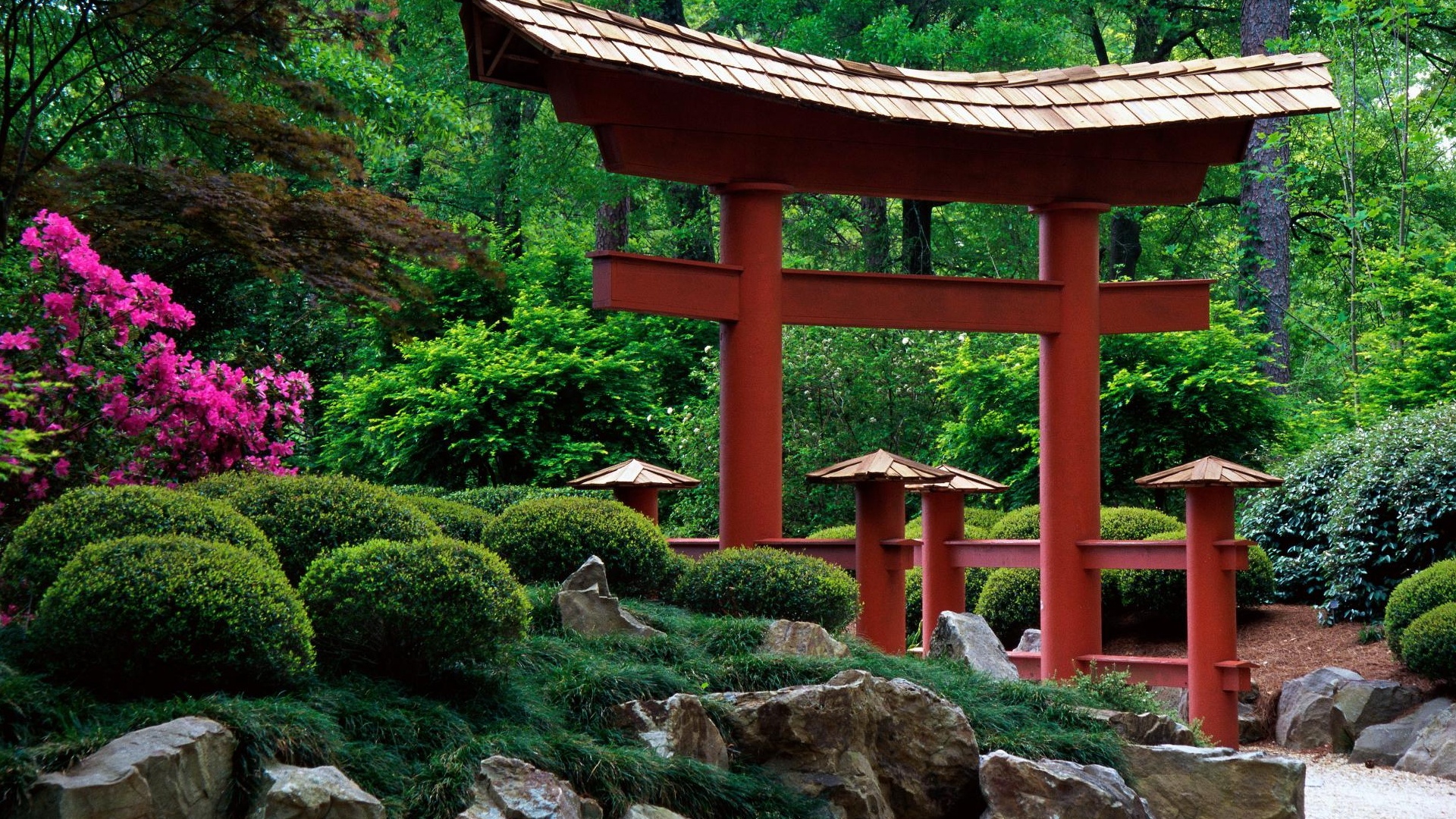
Vibrant and interesting gardens with texture woven throughout and useful
features in every nook and cranny surround a surprisingly sedate home (on the
outside). I believe the contrasts and
illusion in design are the most compelling.So, for fun, I thought I would share how I created my home’s storyboard in case you’re attempting to do the same thing.
Explore:
 I am fairly well-traveled.
It’s the blessing of a military childhood and a blessed adulthood. Beyond that, I’m
I am fairly well-traveled.
It’s the blessing of a military childhood and a blessed adulthood. Beyond that, I’m 
My explorations range from an Asian influence at birth to growing up around the globe but calling Louisiana home. I am drawn to a certain level of intricate décor but refined and classic lines. I can appreciate minimalism and sharp edges, but it’s not something that speaks to me.
From the romance languages to their associated countries and
a love for the vibrance of color used in Asia, it’s created an interesting mix
of images for my idea boards. PS: All the pictures from france and Spain are my own... I forgot to take pics in Japan both times (work).
Capture:

 If it speaks to you, take a picture or buy a garment in the
colors. Have souvenirs of the places and
things that grab you. You may not
understand the message they are speaking immediately, but if you let them pass
you by, you’ll never have the chance to study them and figure it out. This is the great benefit of things like the
Houzz ideabook, Pinterest, and several other similar “pin” sites. It gives you a virtual storyboard. I also advise having a physical one, when it
comes to interior and fashion design, at home.
I have tile samples, fabric swatches, paint samples, and flooring
samples galore. Why? Because I need to know what the house will
feel like as well as the visual impact.
Texture is important.
If it speaks to you, take a picture or buy a garment in the
colors. Have souvenirs of the places and
things that grab you. You may not
understand the message they are speaking immediately, but if you let them pass
you by, you’ll never have the chance to study them and figure it out. This is the great benefit of things like the
Houzz ideabook, Pinterest, and several other similar “pin” sites. It gives you a virtual storyboard. I also advise having a physical one, when it
comes to interior and fashion design, at home.
I have tile samples, fabric swatches, paint samples, and flooring
samples galore. Why? Because I need to know what the house will
feel like as well as the visual impact.
Texture is important.Visit my idea books to see how these are applied to homeideas.
Check out my review on color to see how it can apply toevery part of life!
Purge:
 As you curate your storyboard, some things will fall off
your radar. You’ll come back to it and
while it may be intellectually striking, you’ll find it no longer actually
speaks to you. The color is just a
little wrong or it doesn’t feel pleasant.
Discard those items so they don’t distract you from your core
interests. This is why samples and
virtual boards are great; you won’t waste money and time on large pieces of
furniture or artwork only to find you can’t stand it.
As you curate your storyboard, some things will fall off
your radar. You’ll come back to it and
while it may be intellectually striking, you’ll find it no longer actually
speaks to you. The color is just a
little wrong or it doesn’t feel pleasant.
Discard those items so they don’t distract you from your core
interests. This is why samples and
virtual boards are great; you won’t waste money and time on large pieces of
furniture or artwork only to find you can’t stand it. Mid-century modern = Helvetica Font to me. They have their use and are not displeasing
to the eye, but lack personality or originality (in my mind). They are overly organized to the point of
lack of character. That may not be true,
but it’s how I see it. I would feel
displaced in a home with this design.
Mid-century modern = Helvetica Font to me. They have their use and are not displeasing
to the eye, but lack personality or originality (in my mind). They are overly organized to the point of
lack of character. That may not be true,
but it’s how I see it. I would feel
displaced in a home with this design.
Gothic or Victorian = Old English Font to me. They are ornate and can only be used
minimally. They are accent pieces not a
full paragraph or room of design. If
overused, they drown the senses and make anything beautiful difficult to
discern. Walking through Versailles was
a stunning hit to the senses – great for a visit, but you can’t really LIVE
there. Which Marie knew judging by her
little village down the road.
Arts and Crafts, Classic French, Italian, Moroccan, Tuscan,
and Spanish however all seem to call my name.
Touches of the Industrial, Art Deco and Art Nouveau balance out the
lushness of some of the design which leads me to the next element.
Integrate:

Cultivate:

Looking into 2015, I see color trends after my own heart. I love the idea of not reserving certain
shades for Fall or Winter, but embracing them year round – much like nature.
Elle Décor’s look at Pantone Colors are a brilliant mix of
rich and neutral.
Sherwin William’s ColorMix for 2015 is beautiful. There are only a few colors I find jarring,
but the rest flow together with a classic and cultural vibe.
Even Pantone’s glimpse into the fashion world’s colorpalette will make the spring designs a temptation for me!
No comments:
Post a Comment